blend
branding &
packaging design
project overview
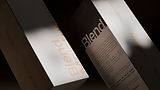
blend is a personal project that reimagines the minimalist skin & bodycare aesthetic while creating a distinct visual presence. rooted in the raw, grounding nature of clay as its core ingredient, the brand aims to redefine skincare through simplicity, texture, and quiet confidence


appreciate the scroll - xo
project brief
-
goal: designing a brand identity with a minimal tone, like minimalist and ordinary, with a punch of boldness.
-
focus: implementing asymmetrical layout to create a distinctive visual presence.
-
issue: similarities of such brands with each other in the premium sector
-
need: a unique visual look representing the core ingredient of product
concept
the visual identity of blend captures the essence of a clay-based skin and body care brand through a minimal yet bold aesthetic. the logo draws inspiration from clay and skin textures, symbolizing the brand’s natural compatibility and safety for the body. packaging follows the same philosophy stripped down, tactile, and intentional, reflecting the purity of what’s inside